iPad Safari Says It Is a Mac: How to Detect and Route iPads
Your device redirect sends iPhones to the App Store and Macs to the Mac page, yet your iPad visitors land on the desktop site. Here is why Safari on iPad says it is a Mac, and how to send iPads to the right link.

Why Your iPad Visitors Land on the Desktop Page
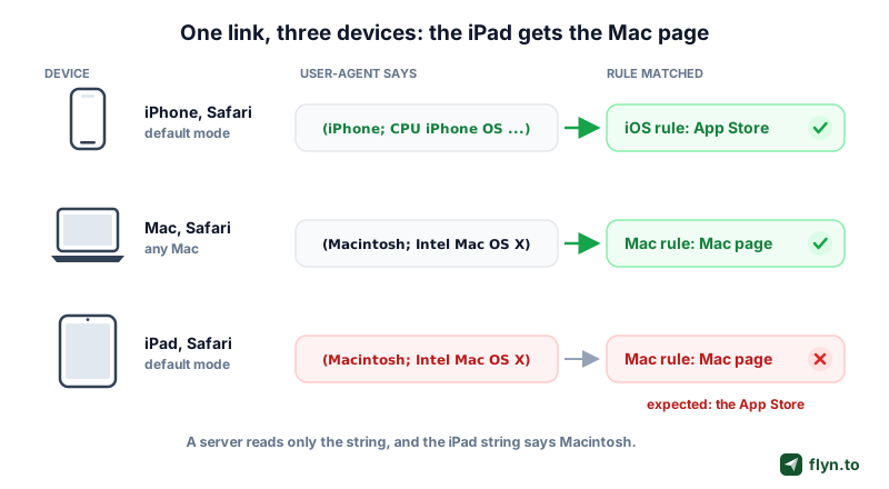
You set up a device redirect. iPhones go to the App Store, Android phones to Google Play, Macs to your Mac download page. Then someone opens the link on an iPad and lands on the desktop page, or on the Mac App Store listing, or on a download their tablet cannot run. Your analytics agree with the redirect: the visit shows up as macOS. Nothing is broken. Safari on iPad is telling your server it is a Mac, on purpose, and has done so since 2019.
If your rule reads only the User-Agent header, an iPad in its default Safari mode matches your Mac rule when you have one and falls through to your default destination when you do not. Either way it misses the iOS rule you wrote for it, whether you are an app publisher, a marketer reading device reports, or a developer running a smart link of your own.
 Tap to enlarge
Below: what changed in iPadOS 13, both user agent strings, why server side detection misreads iPads, each detection method and its limits, and how Flyn's smart routing handles it, with a test matrix to finish.
What Changed in iPadOS 13
In September 2019, Safari 13 brought what Apple calls desktop-class browsing to iPad. The release notes say Safari for iPad now displays the same desktop websites as Safari for macOS. To get those sites, Safari had to stop introducing itself as an iPad. In the WWDC19 session Introducing Desktop-class Browsing on iPad, Apple said iPad would "present itself to websites as a Mac."
Why Apple did it
Plenty of sites used to serve the iPad a phone layout on a laptop sized screen. Sending the Mac user agent gets it the full site, and WebKit adapts desktop pages to touch. The WebKit team's Safari 13 post described the new iPad string as identical to Safari on macOS and asked developers for one responsive design built on feature detection. The WWDC session was blunter: you do not need to know your content is on an iPad.
When an iPad still says iPad
The desktop user agent is the default, not a law. An iPad presents an iPad user agent again when:
- Its owner turns off Request Desktop Website in Safari settings, or asks for the mobile version of one site.
- Safari runs in a narrow Split View or Slide Over window, where Apple said Safari picks the browsing mode on its own.
- An app's embedded web view was built with an older SDK or sets its own user agent, two cases the WWDC session covered.
When Safari 13 shipped, WebKit also named iPad mini as the one model left out of the change. The reverse case matters too: an iPhone using Request Desktop Website sends a Mac style user agent as well, as a WebKit bug about desktop mode on iOS and iPadOS shows.
The Two User Agent Strings, Side by Side
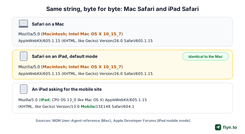
Here is what a current Mac sends, from the Safari example in MDN's User-Agent reference:
Mozilla/5.0 (Macintosh; Intel Mac OS X 10_15_7) AppleWebKit/605.1.15 (KHTML, like Gecko) Version/26.0 Safari/605.1.15
And here is what Safari on an iPad sends in its default mode: the same string, byte for byte. That is the whole problem. There is no iPad token, no touch token, nothing a parser can hold on to.
 Tap to enlarge
What a mobile mode iPad sends instead
When an iPad asks for the mobile site, the string names the device again. A developer posted this one from iPadOS 13 on the Apple Developer Forums:
Mozilla/5.0 (iPad; CPU OS 13_0 like Mac OS X) AppleWebKit/605.1.15 (KHTML, like Gecko) Version/13.0 Mobile/15E148 Safari/604.1
MDN's current iPhone example has the same shape, (iPhone; CPU iPhone OS 18_6 like Mac OS X) followed by Mobile/15E148 Safari/604.1. Both carry a device name and the Mobile token, and common parsers read both as iOS.
Reading the tokens
Macintosh; Intel Mac OS X 10_15_7is the platform. The version no longer moves: MDN's example is a Safari 26 string and still says 10_15_7.AppleWebKit/605.1.15is the engine. Chrome on a Mac says AppleWebKit too, as537.36, but adds aChrome/token Safari lacks.- Missing:
iPad,Mobile, and anything about touch. - Closed in 2022: desktop mode on iOS and iPadOS once reported
10_15_6while Macs said10_15_7. WebKit fixed that as bug 241322, so do not build on leftovers like it.
See What Your Own Browser Sends
The widget below is our free What Is My User Agent tool, running on this page. It shows the exact string your browser sends, how Flyn's analytics would record the visit, and, for a Safari string that looks like a Mac, whether the touch check would call your device an iPad or a Mac.
Run it on three devices
- Open this page on a Mac in Safari: the string says Macintosh and the verdict is a Mac.
- Open it on an iPad in Safari: the string still says Macintosh, and the touch check says iPad.
- Open it on an iPhone, then turn on Request Desktop Website and reload: the string switches to Macintosh too.
When a customer says your link "opened the wrong page", send them the tool link, or paste a user agent from your logs into it. A pasted string carries no touch information, so for a Mac-like Safari string the tool shows both possible answers instead of guessing. For a link opened inside Instagram or TikTok, the in-app browser detector tells you which app is wrapping the page, the problem covered in why links break in the Instagram in-app browser.
Reading your browser
For support teams: ask a customer to open this page and copy the string above, or take it from your logs. The pasted string is analyzed in this page and never sent anywhere. Touch support cannot be known from a pasted string, so a Safari string that says Mac could be a Mac or an iPad.
Flyn Pro
One link for iPhone, Android, Windows and Mac
Give one short link its own iOS, Android, Windows and Mac destinations. On links with a Mac destination, the Safari check above tells an iPad from a Mac. Every other device gets your country rules, A/B split or default page. Pro starts at $9 a month billed annually, or $12 monthly.
Why Server Side Detection and Analytics Get iPads Wrong
A redirect decides from the request headers alone: the user agent, the languages, the referrer, and the network address. It cannot ask the screen anything. When a Mac and an iPad both open a link in Safari, the headers that describe the device are the same, so any rule that reads them, a URL redirect, a CDN worker or a log parser, has to give both one answer, and parsers answer Mac. Country rules are unaffected, since they read where the request comes from, which is why routing by country treats an iPad like anyone else.
Safari sends no client hints
User-Agent Client Hints were designed to replace string parsing with structured headers. Sec-CH-UA-Platform, for example, is a low entropy hint that Chrome and Edge send by default, with a value such as "macOS". Safari does not implement client hints: MDN's compatibility data lists neither the header nor navigator.userAgentData as supported in Safari or Safari on iOS. Hints help you place Chrome on a Mac and say nothing about the one browser that causes the problem.
How Flyn's own analytics record it
Flyn's analytics use the same detection code as the redirect, so they share the blind spot:
- On a link without a Mac URL, a click from Safari on an iPad in its default mode is recorded as desktop, macOS, Safari.
- On a link with a Mac URL, the click is recorded after the device check described below, so an iPad is recorded as a tablet on iOS and an iPhone using Request Desktop Website as a phone on iOS.
- An iPad asking for the mobile site is recorded as a tablet on iOS on every link, because its string says iPad.
Flyn records no visitor identity and counts clicks, not unique people. Click counts and timing are on every plan; the country, city, device, OS, browser and referrer breakdowns are part of click analytics on Pro. How many clicks come from bots, and how they are kept out, is covered in what share of short link clicks are bots.
If the device report on a link aimed at phones and tablets shows a healthy macOS share, some of those Mac clicks are probably iPads. Do not cut an iPad campaign, or start a Mac one, from a user agent report alone. Run the test matrix at the end of this guide on that link first.
Detection Methods Compared: What Works and Where It Breaks
navigator.maxTouchPoints
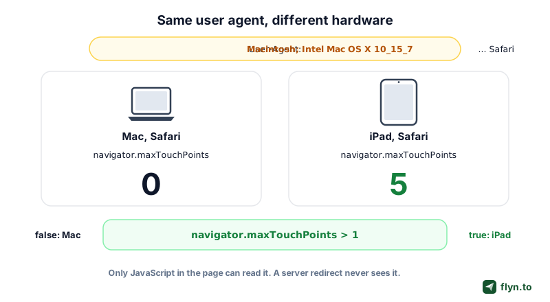
navigator.maxTouchPoints returns how many simultaneous touches the device supports. MDN gives the values: desktop computers without a touchscreen, Macs included, report 0, while phones typically report 5. An iPad reports more than 1, so the test navigator.maxTouchPoints > 1, the multi-touch test MDN's own detection guide shows, separates an iPad from a Mac. Safari has supported it since version 13, the release that changed the user agent.
- Strength: it reflects the hardware, not a string the browser chooses to send.
- Limits: it exists only in JavaScript, so a server redirect never sees it, and it belongs next to the Mac-like Safari string, never alone, because a touchscreen Windows laptop reports touch points too.
 Tap to enlarge
CSS pointer and hover media queries
The pointer media feature reports how accurate the primary pointing device is, coarse for a finger and fine for a mouse, and hover says whether that device can hover. On an iPad, WebKit keeps touch as the primary pointer even with a mouse or trackpad attached, so Safari reports pointer: coarse and hover: none where a Mac reports fine and hover; a mouse changes only any-pointer and any-hover, as WebKit settled in 2020 (bug 209292). That makes pointer: coarse a usable iPad hint, but only the page can read it and WebKit overrides both answers on specific sites, so the touch count stays the plainer test. Keep media queries for tap targets and hover menus.
Screen size
A big screen does not mean a Mac. Apple's spec pages list the 13-inch iPad Pro at 2752 by 2064 pixels and the 13-inch MacBook Air at 2560 by 1664 native pixels, so the tablet has the bigger panel. A Mac can also report a different screen size depending on the scaling its owner picks. Screen size is good for one narrow job: telling a phone from a tablet once you already know the device has touch.
Client hints and navigator.platform
Safari implements neither the client hint headers nor navigator.userAgentData, so there is nothing to read, and a missing hint is weak evidence because Firefox sends none either. Older snippets check navigator.platform; MDN calls platform based detection unreliable, and its browser detection guide warns against using the OS token to decide between mobile, tablet and desktop.
| Method | Where it runs | Tells an iPad from a Mac? | Main limit |
|---|---|---|---|
| User agent string | Server and page | No | Identical in Safari's default iPad mode |
| Client hints (Sec-CH-UA-Platform, userAgentData) | Server and page | No | Not implemented in Safari |
| navigator.maxTouchPoints | Page only (JavaScript) | Yes, with a Mac-like Safari string | Cannot run inside a 302 |
| pointer and hover media queries | Page only (CSS or matchMedia) | Usually, with a Mac-like Safari string | WebKit overrides them on specific sites; any-pointer and any-hover change with a mouse |
| Screen size | Page only | No | iPad and Mac sizes overlap |
| navigator.platform | Page only | No | MDN calls it unreliable for detection |
A JavaScript Check or a Server 302: The Tradeoff
If only the page can tell an iPad from a Mac, you have two designs, each with a real cost.
- A plain 302 is one round trip, needs no JavaScript, and gives every client that sends the same headers the same answer, which keeps testing simple. The price is that it decides blind: an iPad in Safari gets whatever a Mac gets. Why a short link answers with a 302 rather than a 301 is covered in 301 vs 302 redirects.
- A check page adds one hop: the browser loads a small blank page, runs a script, then requests the link again. It needs a sensible answer for when scripts are off, and care with data, because the second request must not count a second click, lose the original referrer, or drop the query string.
The server cannot see a fingertip. Only the page can, and only if you give it a moment to look.
Run the check only where it changes the answer
The sensible rule is narrow. Run the check only for visitors the server cannot place, meaning Safari or another WebKit view presenting a Mac user agent with no platform hint, and only on links where a Mac and an iPad would go to different places. Everyone else keeps the plain 302, so the extra hop never touches Windows, Android, default mode iPhones, or Chrome on a Mac. Referrer handling matters here too, for the reasons in what referrer a short link sends.
How Flyn Handles It on Links With a Mac URL
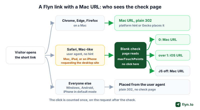
That narrow rule is how Flyn's device routing works. A link can carry four optional device URLs, iOS, Android, Windows and Mac, on top of its default destination, and the order is fixed: device rules, then country rules, then the link's A/B split if it has one, then the default. Device routing is part of Flyn Pro, Lifetime and Team. Because the logic lives in the redirect, it applies wherever the link is opened, a bio, an email or a printed dynamic QR code.
 Tap to enlarge
The blank check page
When a link has a Mac URL and the visitor is Safari presenting a Mac user agent, Flyn answers with a blank page for a moment instead of a redirect. The page holds one small script that reads navigator.maxTouchPoints and requests the same short link again with the answer. The page records no click; the click is counted once, on the second request, which carries the original referrer so a referred visit is not filed as Direct. The query string survives the hop, and so does any #fragment when JavaScript runs; the helper parameters Flyn adds are never passed on to your destination.
Where each visitor goes
- A Mac (no touch points) continues to the Mac URL.
- An iPad continues to the iOS URL. With no iOS URL on the link, it carries on to your country rules, then the A/B split if there is one, then the default destination.
- An iPhone using Request Desktop Website gets the same check and also goes to the iOS URL. A phone sized screen means its click is recorded as a phone, not a tablet.
- With JavaScript off, the page falls back to a plain refresh and the browser continues as a Mac.
- Chrome and Edge on a Mac send a platform hint, and Firefox identifies as Gecko rather than WebKit, so all three skip the page and go straight to the Mac URL.
Everyone else is placed from the user agent alone, crawlers never get routing rules, and a link without a Mac URL routes exactly as before. The check was tested on real iPad hardware and in automated WebKit runs against production. In the API the four fields are targeting.device.ios, android, windows and macos; the links API docs describe the check, and the help article on routing by country or device walks through the editor.
Device and country rules, the Safari check included, do not run on password-protected links, on a link past its click limit, or on mailto, tel and sms links. The Windows and Mac fields accept http or https addresses only, so a store scheme such as ms-windows-store: or macappstore: is refused. Paste the store's web page instead; the formats for both stores are in how to link to the Microsoft Store and the Mac App Store.
What Happens on Links Without a Mac URL
Most device routed links have an iOS URL and an Android URL and nothing for computers. On those links Flyn never shows the check page, and Safari on an iPad behaves the way it would with any server side redirect:
- The user agent says Macintosh, so the iOS rule is skipped.
- There is no Mac rule to match, so the visitor moves on to your country rules.
- If none matches, the link's A/B split picks a destination, when the link has one, as described in A/B testing short links.
- Otherwise the iPad gets the default destination.
In analytics that click reads as macOS on a desktop. Flyn's deep links, which open 16 supported apps such as YouTube and Instagram with a web fallback, read the user agent the same way, so a Mac-like iPad gets the web destination rather than the native-app page; more in deep links that open in native apps.
Make the default page iPad friendly
- Put a visible App Store badge on the default page, so a misrouted iPad is one tap from the install, and give the listing a short, tracked link with the App Store link shortener. If you host your own smart link instead, the free App Store link generator builds an HTML file that routes iOS, Android, Windows and Mac and runs its own touch check, so an iPad that reports a Mac still gets your iOS link.
- Avoid a default page that only makes sense on a computer, such as a lone "download for Mac" button.
- If the page offers desktop downloads, add a line for tablet visitors pointing to the iPad version, next to your Google Play link for Android tablets.
If iPads matter and your link has no Mac URL, you can switch the check on deliberately: set the Mac field to the page Mac visitors should see, even if it is the same page as your default. Safari visitors then go through the check and iPads reach your iOS URL. The trade: every Mac now matches the Mac rule before any country rule or A/B split, and Safari users on a Mac see the blank page for a moment.
A Test Matrix for iPad, Mac and iPhone
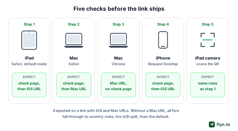
Device routing fails quietly, so test each branch before the link goes on a poster or into an ad. Here is what to expect on a link with iOS and Mac URLs, on the same link without the Mac URL, and what analytics record:
| Device and browser | Link with a Mac URL | Link without a Mac URL | Recorded as |
|---|---|---|---|
| Mac, Safari | Check page, then the Mac URL | Country rules, A/B split, default | Desktop, macOS |
| Mac, Chrome or Edge | Mac URL, no check | Country rules, A/B split, default | Desktop, macOS |
| Mac, Firefox | Mac URL, no check | Country rules, A/B split, default | Desktop, macOS |
| iPad, Safari, default mode | Check page, then the iOS URL | Country rules, A/B split, default | With a Mac URL: tablet, iOS. Without: desktop, macOS |
| iPad, Safari, mobile site | iOS URL, no check | iOS URL | Tablet, iOS |
| iPhone, Safari | iOS URL, no check | iOS URL | Phone, iOS |
| iPhone, Request Desktop Website | Check page, then the iOS URL | Country rules, A/B split, default | With a Mac URL: phone, iOS. Without: desktop, macOS |
| Mac or iPad, Safari, JavaScript off | Mac URL | Country rules, A/B split, default | Desktop, macOS |
 Tap to enlarge
How to run it
- Open the link on an iPad in Safari without changing any settings.
- Open it on a Mac in Safari and in Chrome. Only the Safari run shows the blank page.
- On an iPhone, open it normally, then again with Request Desktop Website on.
- Scan the link's QR code with the iPad camera, since scans follow the same rules. The free QR code generator makes a test code.
- Compare each result with what the What Is My User Agent tool reports on the same device.
If a result surprises you
- An iPad on the default page of a link with a Mac URL usually means the link has no iOS URL, so the iPad fell through as described above.
- A Mac in Safari landing on the iOS URL is worth a closer look: open the user agent tool on that Mac and check the touch verdict.
- The redirect checker shows the plain redirect chain a script sees, useful for ruling out a wrong default, and the deep link tester checks an app link on a real phone.
For the wider picture, read one link, different destinations by device, and for tool by tool scores, the device routing shortener comparison.
Frequently Asked Questions
Why does my iPad say Macintosh in its user agent?
How do I detect an iPad in Safari with JavaScript?
Can a server tell an iPad from a Mac?
Why does my device redirect send iPads to the desktop page?
Do User-Agent Client Hints fix iPad detection?
Does Request Desktop Website on an iPhone change the user agent?
Why does Flyn show a blank page before some links open in Safari?
Will my analytics count iPad visits as Mac visits?
Free tools for this
Three Flyn tools that pair well with the strategy in this article, all free, no signup needed.
UTM Builder
Build campaign-tracked URLs in seconds.
Broken Link Checker
Scan any page for dead links and 404s.
Open Graph Checker
Preview how URLs unfurl on social.
Keep reading
Three related deep-dives from the Flyn blog.

Postback URL Tracking: How S2S Conversion Tracking Works
17 min read
The Anatomy of a URL: Every Part Explained in Detail
15 min read

301 vs 302 Redirect: When to Use Each
14 min read
Ready to try Flyn?
Free plan includes 25 links/month, full analytics, and access to all 30+ free tools above. No credit card required.
Already a member? Log in
Karan Bhakuni is the founder of Flyn. He writes about branded links, click analytics, and the link-management tooling growth teams and creators actually need, drawn from building Flyn and reading a lot of user feedback.
Find these guides useful? Add Flyn as a preferred source so more of them show up in your Google results.